
系統組合攤位
2026台北食品暨特色美食國際博覽會攤位設計|2格攤位設計施工案例 2026 Taipei Food and Specialty Cuisine International Expo
2026台北食品暨特色美食國際博覽會攤位設計|2格攤位設計施工案例 2026 Taipei Food and Specialty Cuisine International Expo
2026/5/1~5/4
台北世貿一館 Taipei World Trade Center Hall 1
台北世貿一館 Taipei World Trade Center Hall 1
詳細介紹
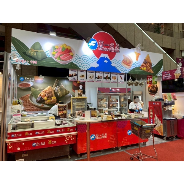
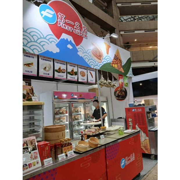
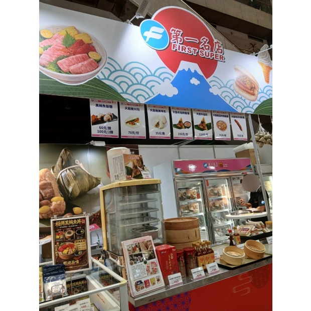
這2格攤位整體設計呈現出濃厚的日式和風與節慶氛圍,視覺主軸以「第一名店 FIRST SUPER」為核心品牌識別,透過鮮明的紅、白、藍配色,建立強烈且易辨識的品牌印象。上方大型招牌運用日本象徵性的元素,如富士山、旭日、海浪紋樣,搭配簡潔線條與插畫風格,營造出清新又具文化意涵的背景,讓人一眼就聯想到日本美食與職人精神。
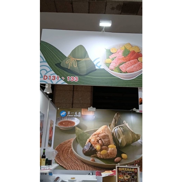
攤位設計主打商品「粽子」,透過大面積的高解析食物視覺輸出,呈現飽滿的米粒、油亮的肉塊與配料,極具誘惑力。畫面中的粽葉包裹與拆開後的內容形成對比,不僅強化產品特色,也讓消費者快速理解商品內容與價值。這種「放大食物」的設計策略,有效提升吸引力與停留率,是展覽攤位中常見且成功的手法。
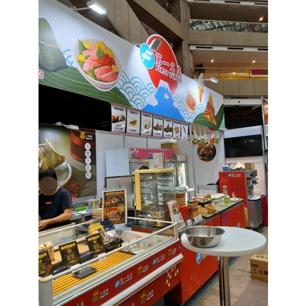
攤位結構採開放式設計,前方為展示與銷售區,後方配置冷藏設備與備料空間,動線清楚且實用。櫃檯以紅色為主體,搭配品牌圖騰與細緻紋樣,增添質感同時呼應整體視覺。檯面上擺放蒸籠、調味品與實體商品,營造出現場製作與新鮮感,讓顧客產生信任與購買衝動。
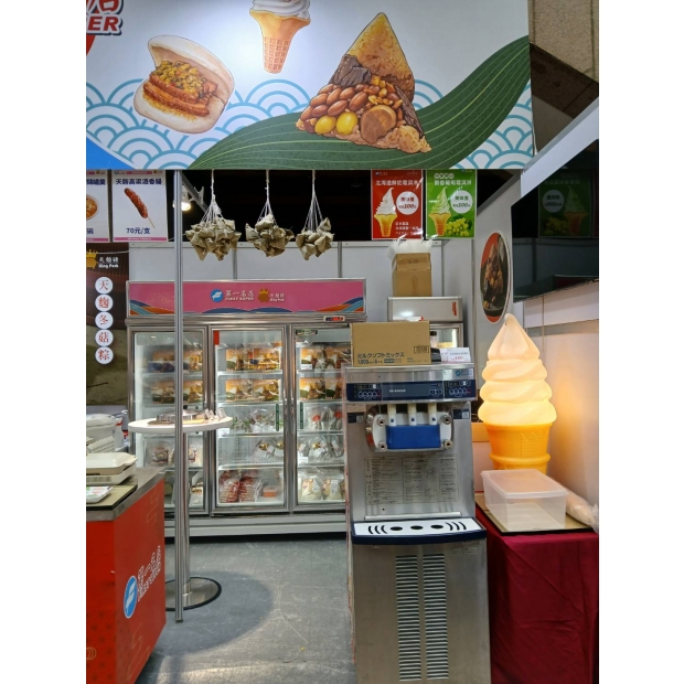
上方菜單區整齊排列,搭配圖片與價格標示,資訊清楚透明,降低消費者決策門檻。每一項產品都有對應圖片,強化視覺溝通效果,也讓不同語言背景的顧客都能輕鬆理解。右側懸掛的粽子串,則成為一個吸睛的小亮點,不僅增加立體層次,也帶出節慶與手工感。
燈光配置上,採用重點打光方式,將光源集中在招牌與主視覺上,使產品與品牌更突出。在整體空間較為中性的展場環境中,這樣的照明策略有效提升攤位辨識度與吸引力。
These two booth spaces are designed with a strong Japanese style and festive atmosphere. The visual focus centers around the core brand identity, "First Super," using bright red, white, and blue to create a striking and easily recognizable brand impression. The large sign above features iconic Japanese elements such as Mount Fuji, the rising sun, and wave patterns, paired with clean lines and an illustration style, creating a fresh background rich in cultural meaning, instantly evoking Japanese cuisine and craftsmanship.
The booth's key product is zongzi (rice dumplings). Through large, high-resolution food visuals, the fluffy rice, glossy meat chunks, and fillings look incredibly tempting. The contrast between the wrapped leaves and the opened zongzi not only highlights the product’s features but also helps consumers quickly understand the item and its value. This "food enlargement" design strategy effectively boosts attraction and dwell time, a common and successful approach for exhibition booths.
The booth features an open layout, with the front area for display and sales, and the back equipped with refrigeration and prep space, making the traffic flow clear and practical. The counter is mainly red, accented with brand motifs and fine patterns, adding quality while complementing the overall visual style. Steamers, seasonings, and physical products are displayed on the counter, creating a sense of on-site preparation and freshness, inspiring trust and purchase impulse.
The menu area above is neatly arranged, including pictures and prices, making the information clear and transparent, reducing barriers for customers to make decisions. Each product has a corresponding image, strengthening visual communication and making it easy for customers of different language backgrounds to understand. On the right side, hanging strings of zongzi serve as a small eye-catching detail, adding depth and emphasizing the festive and handcrafted feel.
For lighting, key spotlights are used to focus on the signage and main visuals, making the products and brand stand out. In the generally neutral exhibition environment, this lighting strategy effectively enhances the booth's recognition and appeal.