
系統組合攤位
台日友好☆美食展 Taiwan-Japan Friendship☆Food Expo
台日友好☆美食展 Taiwan-Japan Friendship☆Food Expo
攤位數:20格
日本美食區 Japanese food district
台北世貿一館 Taipei World Trade Center Hall 1
日本美食區 Japanese food district
台北世貿一館 Taipei World Trade Center Hall 1
詳細介紹
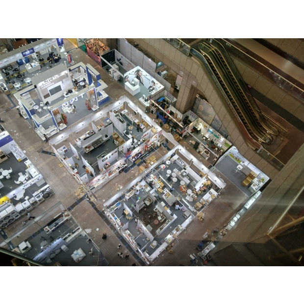
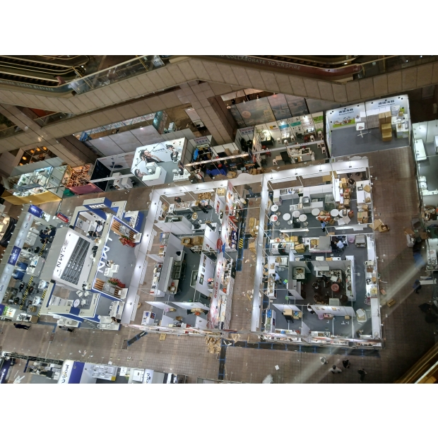
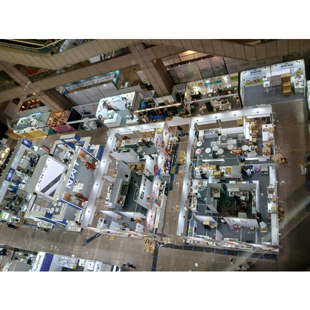
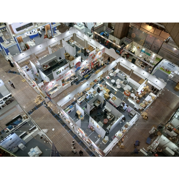
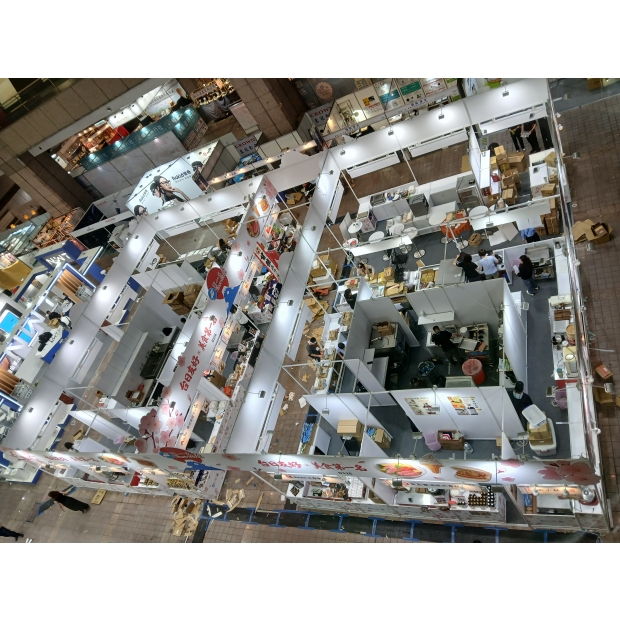
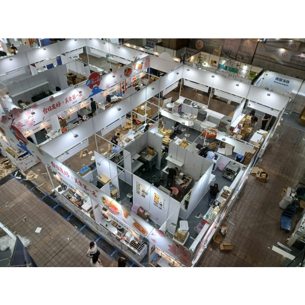
從整體空間規劃來看,本案採用「區塊式街廓布局」,以中央主通道為軸心,向四周延伸攤位配置,形成類似日式市集的逛街動線。這樣的設計不僅有效分散人流,也讓每一格攤位都具備良好的曝光機會,避免傳統展場常見的邊角攤位人潮不足問題。20格攤位透過模組化系統組合,在有限空間內達到最大坪效,同時保有動線流暢與視覺開闊感。
在視覺設計上,雨耕團隊以大面積白底搭配櫻花粉色系,建立出乾淨且具日本氛圍的基調。上方橫跨整區的高空招牌結構,採用連續式櫻花枝圖騰延伸,不僅強化整體主題一致性,也在遠距離即可清楚辨識展區位置。主視覺「台日友好☆美食第一名」以紅色手寫風字體呈現,搭配星號符號,成功營造出活潑且具記憶點的品牌語言,讓參觀者在第一眼就建立情緒連結。
在結構設計上,本案採用標準鋁料系統搭配客製化包板輸出,兼顧施工效率與視覺完整性。每個攤位上方皆設置統一規格的主視覺加高看板,透過一致的燈光配置,讓整體展區在亮度與節奏上保持均衡,同時提升品牌識別清晰度。燈具採用暖白光投射,不僅能突顯食品色澤,也讓整體氛圍更接近日式美食街的溫暖感受。
在細節設計上,雨耕團隊特別強化「可逛性」與「可拍性」。例如在轉角位置加入大型立體冰淇淋模型與食品圖像輸出,吸引人潮停留與拍照分享;櫻花圖騰不僅出現在高空招牌,也延伸至攤位下緣與側板,形成完整包覆的視覺語言,使整區從任何角度觀看都具有一致性。此外,各品牌招牌保留適度彈性,讓參展商可以呈現自有識別,同時不破壞整體美感,達到「統一中有差異」的設計平衡。
在機能面上,本案充分考量食品展的實際需求。每格攤位皆預留設備擺放與電力配置空間,動線設計亦兼顧工作人員補貨與顧客排隊動線,避免交錯干擾。從施工現場可見,後場空間與前場銷售區清楚區隔,讓營運更有效率。同時,攤位高度與開口比例經過精準控制,使顧客視線能自然聚焦於商品展示,提高成交轉換率。
整體而言,此20格攤位不只是單一展位集合,而是一個具主題、具故事性的「微型展中展」。雨耕展覽設計透過系統化規劃、視覺整合與動線策略,成功將「台日友好」的概念轉化為可被感受、可被消費的空間體驗。不論是在遠距離吸引目光的高空視覺,或是近距離促進購買的攤位細節,都展現出高度的專業整合能力。
最終呈現的不僅是裝潢完成度,更是一個能夠帶動人流、提升品牌價值並創造實際業績的展場解決方案,充分體現雨耕展覽設計在食品市集與主題展區規劃上的實戰實力。
This "Taiwan-Japan Friendship Food Theme Area," planned and executed by the Yugeng Exhibition Design team, features 20 booths. The overall design centers around the visual theme of "Japanese Cherry Blossoms in Spring," blending efficient flow for a food market with brand display needs, successfully creating a highly recognizable and crowd-attracting themed street within the exhibition space.
From the overall spatial planning perspective, this project uses a "block-style street layout," with the central main aisle as the axis and booths extending outward, forming a strolling path similar to a Japanese market. This design not only effectively disperses the crowd but also gives each booth good exposure, avoiding the common problem of low foot traffic at corner booths in traditional exhibitions. The 20 booths are modularly combined to maximize space efficiency while maintaining smooth flow and a sense of openness.
In terms of visual design, the Yugeng team used large areas of white backgrounds paired with cherry blossom pink tones to create a clean base with a Japanese atmosphere. High signs spanning across the area feature continuous cherry blossom branch motifs, enhancing thematic consistency and allowing the area to be easily identified from a distance. The main visual, "Taiwan-Japan Friendship☆Number One Food," is presented in red handwritten-style font with star symbols, creating a lively and memorable brand message that instantly connects with visitors emotionally.
Structurally, the project uses standard aluminum systems combined with custom panels, balancing construction efficiency and visual integrity. Each booth has a uniform elevated main sign, with consistent lighting ensuring even brightness and rhythm throughout, while improving brand visibility. Warm white lighting highlights the food's colors and adds a cozy, Japanese food street atmosphere.
Detail-wise, the Yugeng team emphasized "walkability" and "photo-friendliness." For instance, large 3D ice cream models and food image outputs are placed at corners to attract visitors and photo sharing. Cherry blossom motifs appear not only on the high signs but also extend to the booth edges and side panels, creating a complete visual language that ensures consistency from all angles. Brand signage retains some flexibility, allowing exhibitors to showcase their identity without disrupting the overall aesthetic, achieving a "unity with variation" design balance.
Functionally, the project fully considered the practical needs of a food exhibition. Each booth reserves space for equipment and power, and the layout accommodates staff restocking and customer queue flows without interference. The back area is clearly separated from the front sales area, making operations more efficient. Booth height and opening proportions are precisely controlled to naturally focus customer attention on products and increase conversion rates.
Overall, these 20 booths are not just a collection of individual spaces but a themed, story-rich "mini exhibition within the exhibition." Through systematic planning, visual integration, and circulation strategies, Yugeng Exhibition Design successfully transformed the concept of "Taiwan-Japan Friendship" into a tangible, consumable spatial experience, whether through eye-catching high visuals from afar or up-close engagement. ...
Whether it's the high-altitude visuals that catch attention from afar or the detailed booth design that encourages purchases up close, it all shows a high level of professional integration. What’s ultimately presented isn’t just a finished decoration—it’s a trade show solution that drives foot traffic, boosts brand value, and delivers real results, fully showcasing YuGeng Exhibition Design's hands-on expertise in planning food markets and themed exhibition areas.