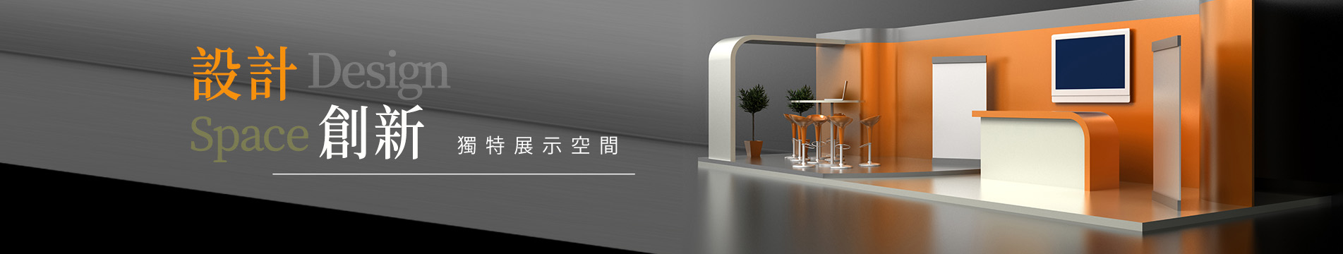
系統組合攤位
台北國際包裝工業博覽會 TAIPEI PACK
台北國際包裝工業博覽會 TAIPEI PACK
展覽地點:南港展覽館一館4樓
客戶:和陞股份有限公司
攤位數:1格
攤位尺寸:3*3m 4mh
Exhibition location: 4th floor, Hall 1, Nangang Exhibition Center
Client: Ho Sheng Co., Ltd.
Number of booths: 1 Booth
size: 3*3m 4mh
客戶:和陞股份有限公司
攤位數:1格
攤位尺寸:3*3m 4mh
Exhibition location: 4th floor, Hall 1, Nangang Exhibition Center
Client: Ho Sheng Co., Ltd.
Number of booths: 1 Booth
size: 3*3m 4mh


詳細介紹
整體設計亮點
1. 視覺主題統一性強
使用大量自然綠色葉片背景,呼應產品的「環保」、「可回收」特性,塑造出清新、友善環境的形象。
顏色搭配以綠色系為主,輔以亮黃色標題條吸睛,使品牌主旨與產品訴求一目了然。
2. 品牌識別明確
公司名稱「和陞股份有限公司」與主打產品「天王界伸縮膜」清晰可見,並放在視線最容易聚焦的位置(上方大招牌與中間板面)。
搭配圖示說明與獎項認證(如GRS標章),強化專業與可信度。
3. 內容資訊清楚分區
面板資訊分區明確(如企業目標、產品特色、使用案例、環保理念等),讓訪客可以快速吸收重點。
採用黃底黑字做對比,字體大小適中、易於閱讀。
4. 互動與展示空間安排得宜
攤位內部預留空間作為洽談區,並設有展示品與影片螢幕,結合動態與實體展示,提高停留時間與互動性。
櫃台安排在外圍角落,方便接待與發放資料。
吸引人的特色
1. 高亮度視覺引導
招牌採用黃光白光混合打光,讓攤位照明更有層次。
2. 產品主打訴求強烈
關鍵詞如「超長拉伸」、「高韌性抗穿刺」、「100%再生塑膠原料」等標語突出,對專業買主有強烈吸引力。
3. 友善、綠能形象營造
「環保」、「永續」、「綠色包裝」等形象明確傳遞,搭配植草造型的櫃檯邊緣細節,整體環保意象貫徹到底。
4. 現場人員互動積極
工作人員穿著有品牌識別的服裝,主動與參觀者講解與互動,提升專業度與親切感。
Overall Design Highlights1. Strong Visual Theme UnityUsing a large amount of natural green leaf backgrounds, echoing the product's characteristics of "environmentally friendly" and "recyclable," creates an image of a fresh and friendly environment.The color scheme mainly features greens, complemented by bright yellow title bars to attract attention, making the brand's purpose and product appeals immediately clear.2. Clear Brand IdentityThe company name "Hoesung Co., Ltd." and the flagship product "Kingworld Stretch Film" are clearly visible, placed in positions that are easy for the eye to focus on (top signage and center panel).Accompanied by graphical explanations and award certifications (like GRS certification), it enhances professionalism and credibility.3. Clearly Defined Information SectionsThe panel information is clearly segmented (such as corporate goals, product features, use cases, environmental philosophy, etc.), allowing visitors to quickly absorb key points.Using yellow background with black text for contrast, the font size is moderate and easy to read.4. Proper Arrangement of Interactive and Display SpacesThe booth reserves space for negotiation, featuring display items and video screens, combining dynamic and physical exhibitions to increase dwell time and interactivity.The reception counter is arranged in an outer corner for easy welcoming and distribution of materials.Attractive Features1. High Brightness Visual GuidanceThe signage uses a mix of yellow and white light, providing a layered look to the booth lighting.2. Strong Product AppealKeywords such as "super long stretch," "high toughness puncture resistance," and "100% recycled plastic raw materials" are highlighted, strongly attracting professional buyers.3. Creating a Friendly, Green Energy ImageClear transmission of images like "environmentally friendly," "sustainable," and "green packaging" is combined with details of the grass-shaped counter edges, ensuring an overall environmental imagery.4. Active Interaction of On-Site StaffStaff members wear clothing with brand identification and actively engage with visitors to explain and interact, enhancing professionalism and friendliness.